When you are in the craft doldrums it helps to shake it up and try something you’ve never tried. I got some inspiration by these neutral images on Pretty Little Paper Crafts (tons of inspiration, I add to it almost daily) and thought I’d try printing some digitals in black and white and sepia. This forced me to think more about stamp placement and elements as the focal point on a neutral background and it offered a chance to make things in sets for pleasing cohesiveness in journal creation. This was so much fun and would make a wonderful start for doing some ATC cards and improving composition. I can also envision this technique for card bases as I can instantly transform an image from feminine to masculine. It will instantly age almost any image. I can also combine two images from the same digital, one in color and one in neutral to come up with more artistic effects.
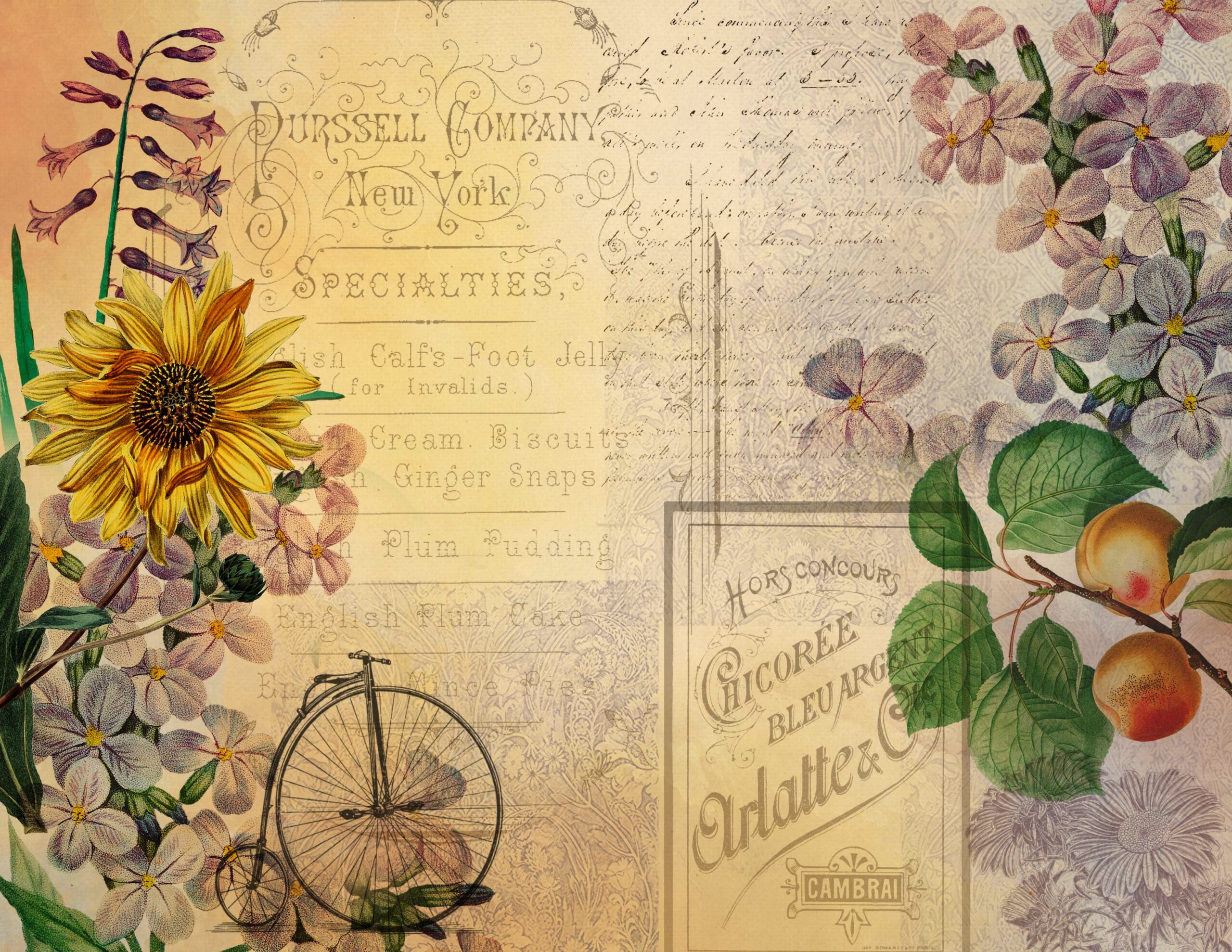
I used Photoshop desaturate and black and white. Black and white allowed me to play around with the image to achieve different types of effects and contrast whereas desaturate just changes the image to grayscale. I can also choose hue to create an image in sepia. I have many that would work but I chose Lelia’s Story for the large sunflower image and the bicycle to start. I also used Vintage Labels, Random Labels and Vintage Journaler’s Companion to complete my designs. An important point, when you choose your images from digitals don’t forget to give them a different name or make a copy on your computer and use that to play around with. Don’t save as is with the same title or you will lose your original.
A few tips:
If you don’t have Photoshop, many online editing software features the ability to make images in sepia or black and white. Try GIMP.
Look for images that have a lot of contrast and/or text. You’ll also want a strong focal point image. My inspiration images are shown below (links included if there are any).
I hope this post inspires you to take a look at your digitals, print them in black and white, sepia or even a tint to see how this inspires you to use them in different ways. A free sample pack is offered below to try your hand at a tonal design.
Happy paper crafting!
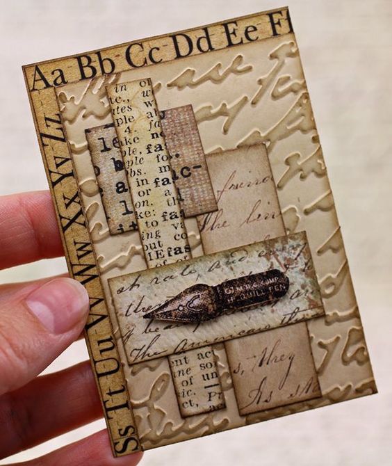
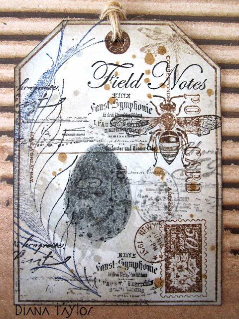
This image basically only has one focal point while the rest is quite neutral. The composition is fabulous.
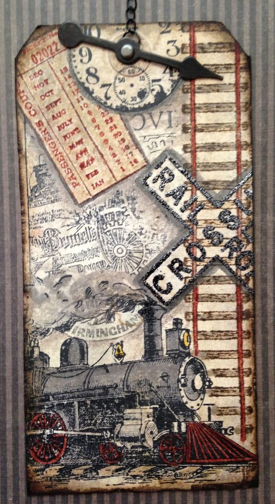
The red is eye catching and the track motif helps lead the eye down the page while the placement of the crossing sign takes your eye back to the train. Wonderful.
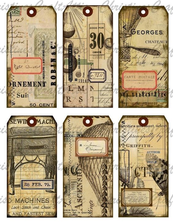
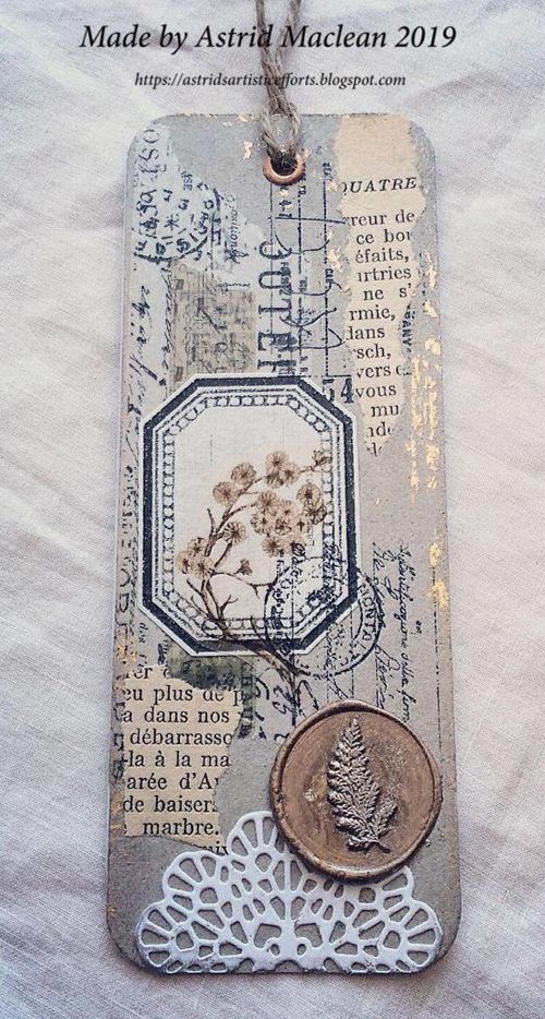
Striking images and the first to catch my eye and spur this idea. I am sure I could use Collectanea to do something similar.
I revisit these striking ATC’s often as they offer a lot of inspiration.
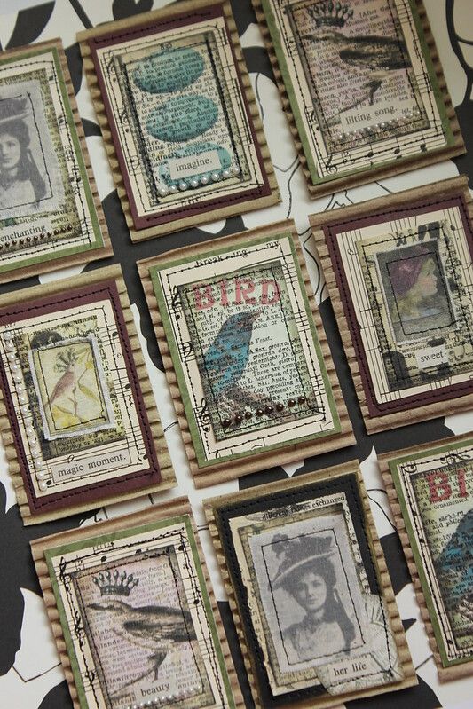
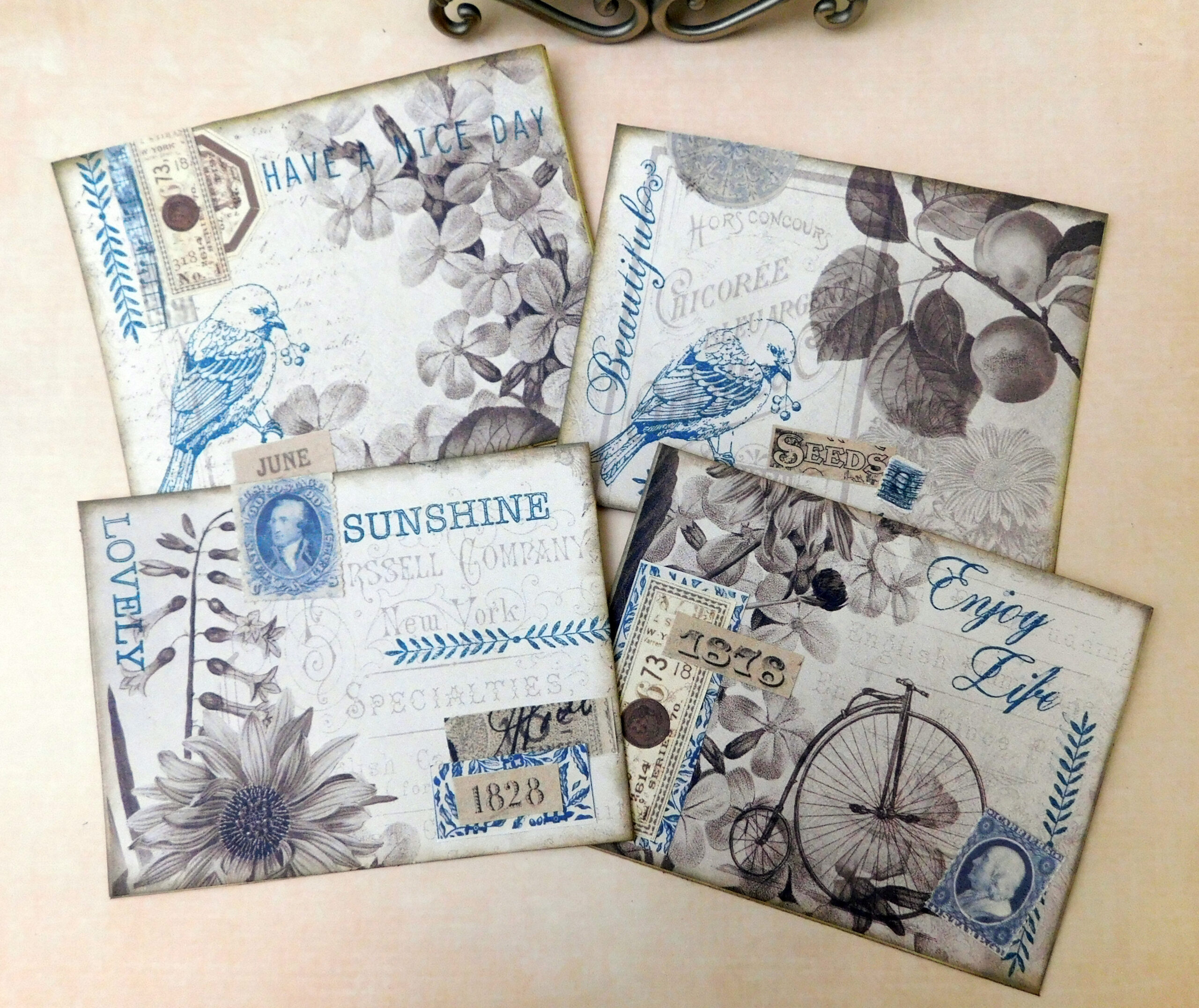
This is not tonal but is still neutral enough for the blue to really stand out.
A single color is also an option, love how the blue and gray makes the warm colors stand out even more.
Gatherings - Finished Pieces
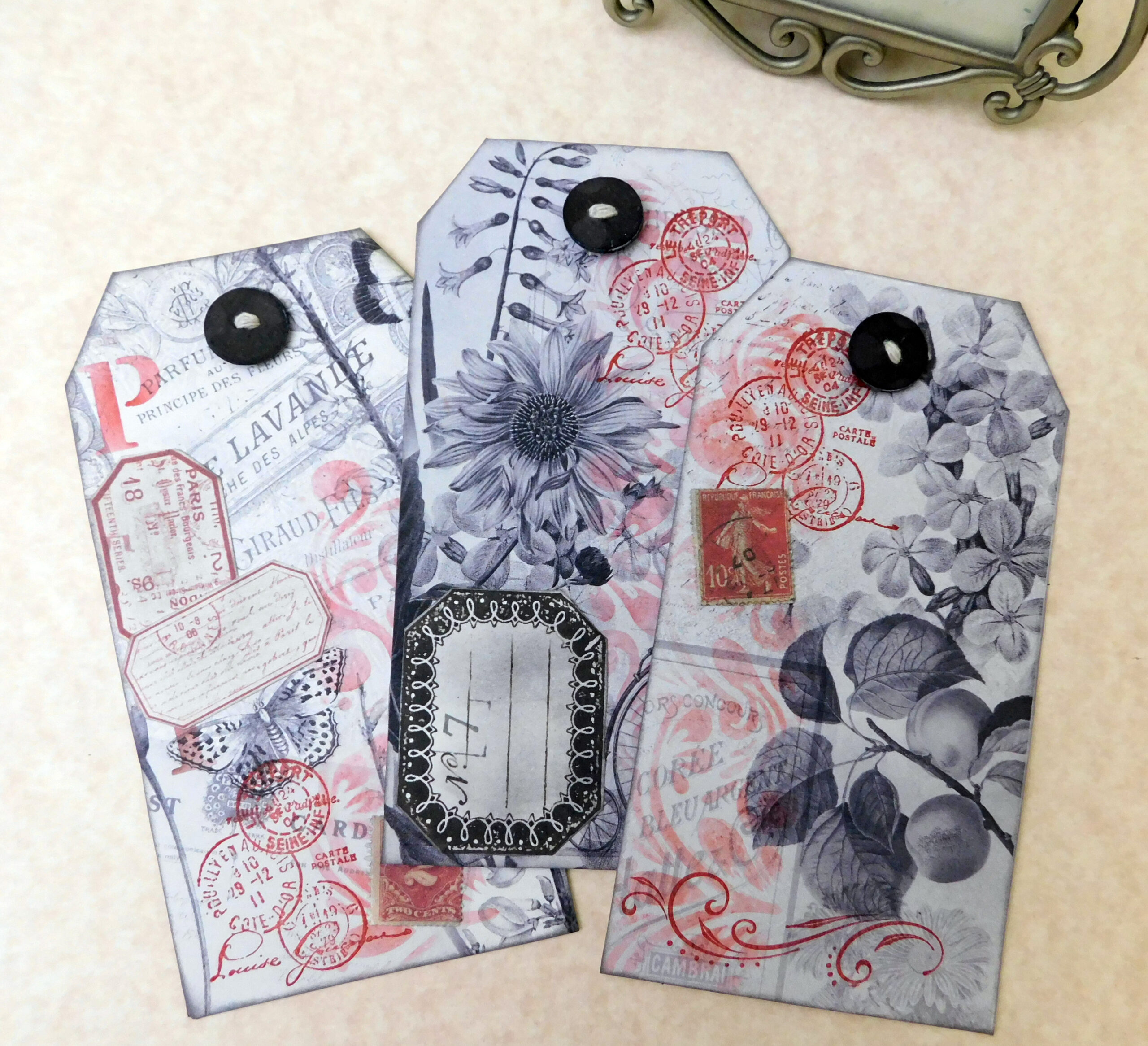
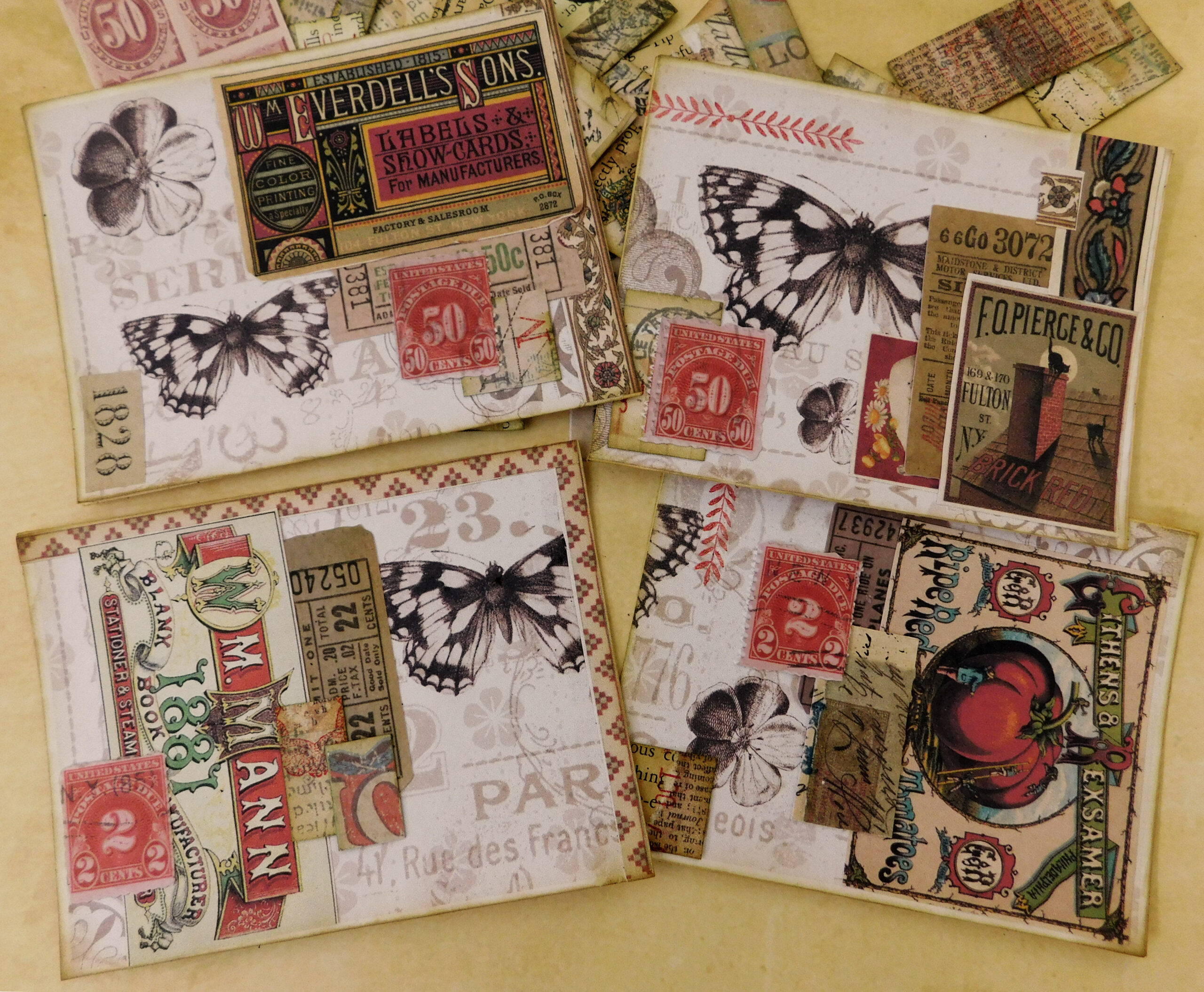
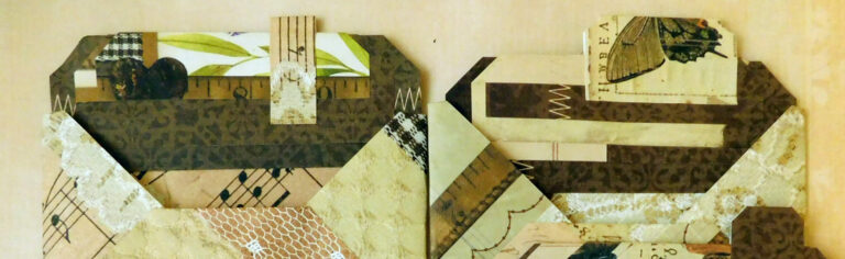
I began with two images from this kit, Lelia’s Story and then just chopped them up to make sure I had a focal point for each finished piece.
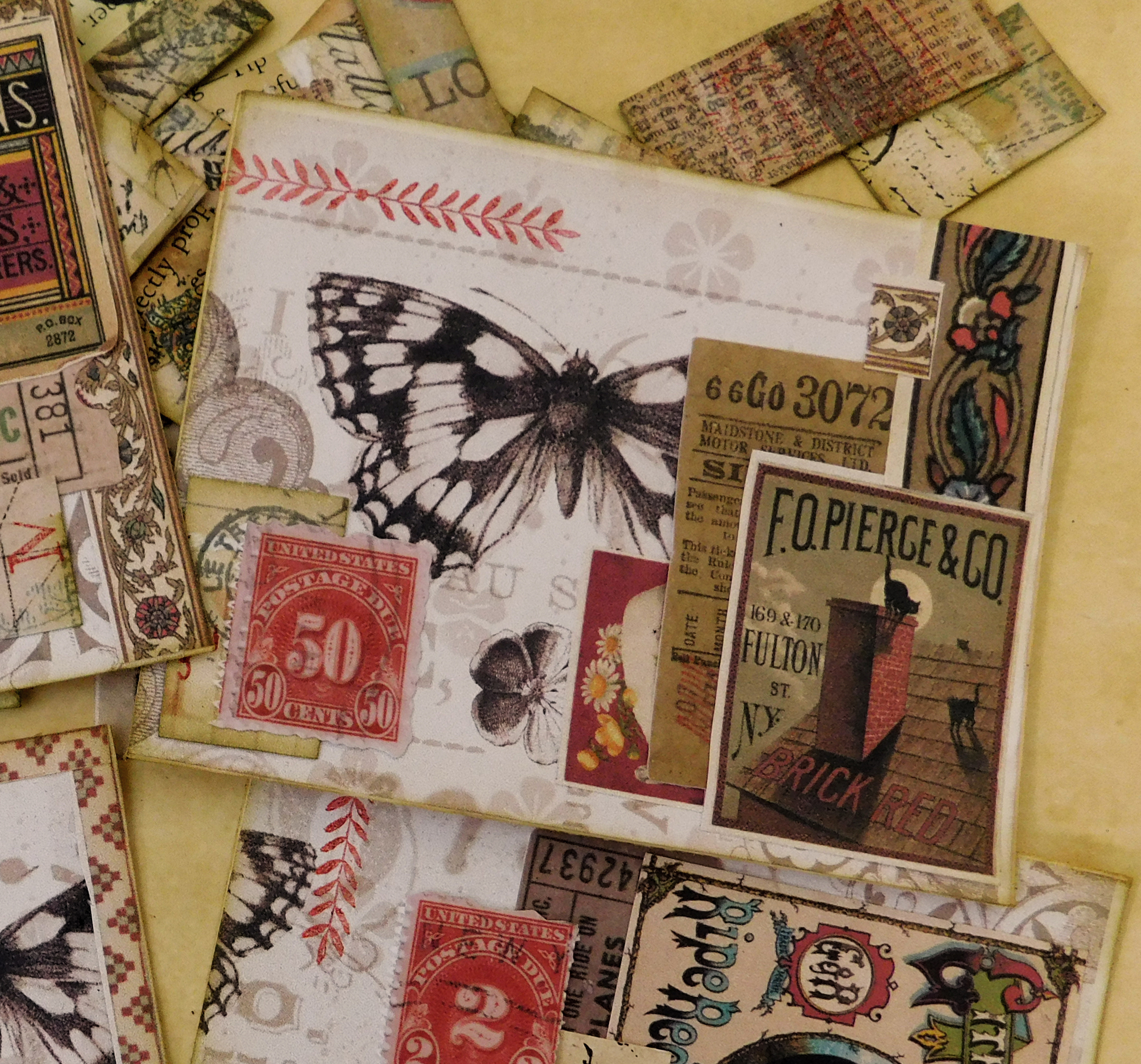
My first attempt. I love the images, I knew I wanted red but since I didn’t know if I wanted to stamp, stencil or just add a colorful addition I pretty much tried all three, after all it’s only paper. I would stick to one or two choices for a better result, it’s a little too busy.
My original layout intent got shifted a little in the video so I felt I had to fill that blank space at the top and brought in one stamp.
This was so much fun and I will definitely be exploring this technique further for ATC’s and card bases. Once I didn’t overdo it with too much variety and stuck with only two types of additions, stamping and elements I liked them so much better.
My third attempt using Bohemian Paper Collection. This time I chose ephemera only for the most part, just one little stamp to co-ordinate the borders I had to add to others so I didn’t have to trim (for some reason my papers were too short for the base). I think I printed at 75% and I could’ve avoided any pasting (and not fitting, hence the border) by printing on card stock in the first place.
Video Tutorial
A video tutorial of my third attempt at this technique.
What you’ll need:
Any digital transformed and printed in black and white or sepia.
Stamps, stencils, ephemera for decorating your neutral image.
Glue & scissors
New Products
Ruth on 26 Nov, 2022
5 out of 5 stars “The printables and ephemera are beautiful and fit the style I adore. Another artist mentioned Expresso Press and I am so happy I followed her referral”.
This product offered as a free download sample paper pack, no sign up necessary, will download automatically to your computer. Let me know what you made and share on FB, I’d love to see it.